How to make a color palette for digital art, and pick colours with the eyedropper (Sketchar and Procreate)
A simple method for building a colour palette that works, five palette types, the new colour palette and eyedropper in Sketchar 11, and how to save palettes in Procreate.
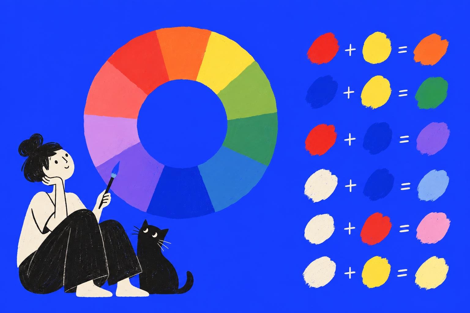
Short answer: a good colour palette for a drawing is small: one main colour, one or two supporting colours, an accent, and a light and a dark. Build it from a harmony on the colour wheel or pick it straight from a photo with the eyedropper, check that the values (light and dark) are far enough apart, and keep it in one place so every layer uses the same set. Sketchar 11 has a new colour palette with Grid, Wheel and Sliders views, an eyedropper and a row of your recent colours; Procreate saves palettes in its Palettes tab.
What makes a colour palette work
Few colours. Five to eight is plenty for an illustration. More makes the picture noisy.
One leader. One colour covers most of the picture, one or two support it, one accent appears in small doses. A common split is 60 / 30 / 10.
Value range. Your palette needs a real dark and a real light. Two colours with the same brightness blur together, however different their hues are.
Temperature. Warm light, cool shadows (or the other way round) makes a picture feel lit.
Five colour palette types
Monochrome. One hue in several values. Calm, and the best way to learn value.
Analogous. Neighbours on the wheel, such as yellow, orange and red. Harmonious and warm.
Complementary. Opposites on the wheel, such as blue and orange. High contrast; let one dominate.
Split complementary. One colour and the two neighbours of its opposite. Contrast that is easier to balance.
Triadic. Three colours evenly spaced on the wheel. Lively; mute two of them.
Colour gets the attention, but value does the work. Check your palette in greyscale before you fall in love with it.
The colour palette and eyedropper in Sketchar
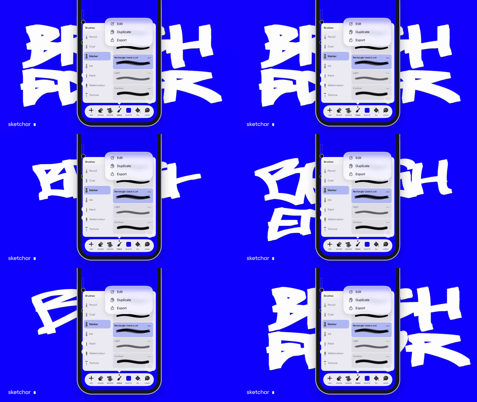
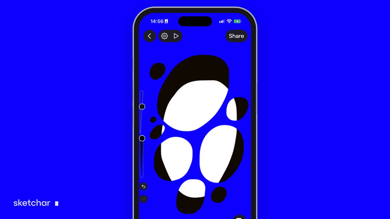
Sketchar 11 redrew the drawing screen around a new colour palette, on iOS and Android.
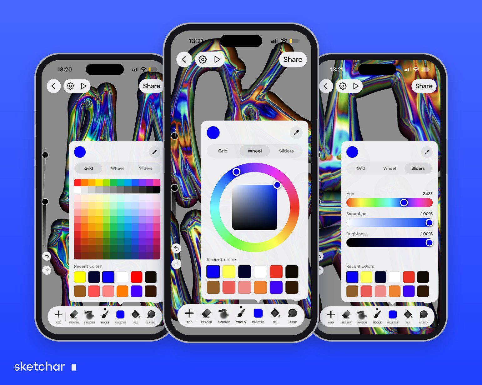
Three views. Grid for quick swatches, Wheel for harmonies, Sliders for exact values.
Eyedropper. Pick any colour from the canvas or from an imported reference.
Recent colours. A row of the colours you just used, so shadows and lights stay consistent across layers. Together with a swatch layer, it keeps your palette one tap away.
Long-press eyedropper. An optional gesture in the drawing settings: hold your finger on the canvas to pick a colour.
The light theme and the left-hand mode in the same update help with colour work too: a light interface makes it easier to judge colours, and left-handed artists can mirror the layout.
Once the palette is set, apply it in layers: flats first, then shadows on Multiply and light on Screen; see blend modes explained.
How to make a colour palette from a photo
The fastest way to a believable palette is to borrow it from a picture you like.
Step 1 – Import the photo as a reference
Put it on its own layer or beside the canvas.
Step 2 – Pick five or six colours with the eyedropper
Take the largest area first, then the shadow, the light, a mid-tone and one accent.
Step 3 – Check the values
Switch the picture to greyscale or squint at it. If two colours look the same, make one lighter or darker.
Step 4 – Keep the palette at hand
In Sketchar, the colours you just used stay in the Recent colours row. In Procreate, save the colours as a palette. In any app, a simple trick works too: paint a small swatch of each colour in a corner of the canvas on its own layer, and pick from it with the eyedropper whenever you need it. Hide the layer before you export.
Colour palettes and the eyedropper in Procreate
The Colors panel has Disc, Classic, Harmony, Value and Palettes views. In Palettes, tap + to create a new palette, or make one from the camera, a file or a photo. To pick a colour from the canvas, touch and hold anywhere with your finger, or use the square button on the sidebar.
FAQ
How do I make a colour palette for digital art? Pick one main colour, one or two supporting colours and an accent, add a light and a dark, and check the values in greyscale.
How many colours should a palette have? Five to eight for an illustration.
Does Sketchar have an eyedropper? Yes. The Sketchar 11 colour palette has an eyedropper, and you can turn on a long-press eyedropper gesture.
How do I make a colour palette in Procreate? Open Colors, go to Palettes and tap +. You can start empty or create one from the camera, a file or a photo.
How do I use the eyedropper in Procreate? Touch and hold on the canvas, or tap the square button on the sidebar.
What is the 60-30-10 rule? A colour split: about 60 % main colour, 30 % supporting colour and 10 % accent.
Pick your colours and paint. The new colour palette in Sketchar Canvas, on iOS and Android. Open Canvas
▋